Millennium Bank — electronic banking
Redesigning electronic banking through customer behaviour analysis, iterative prototyping, and usability testing.
My role
I led the design team during part of the wider redesign, helped decide the final UX solutions, and designed critical parts of the experience myself. The project started in late 2016 and ran for more than two years.
The work combined research and analysis, stakeholder workshops, detailed interaction design, and collaboration across design and development.
Understanding actual behaviour
I benchmarked banking products alongside other online services to understand both established expectations and opportunities for a better experience.
Using Webtrends, I analyzed usage data covering more than half a million individual customers: frequently visited pages, clicked links, entry points, and time spent on pages. This helped inform delivery priorities and the role of the post-login dashboard.
The analysis shifted my approach toward a personalized home page that surfaced relevant information and actions immediately after login.
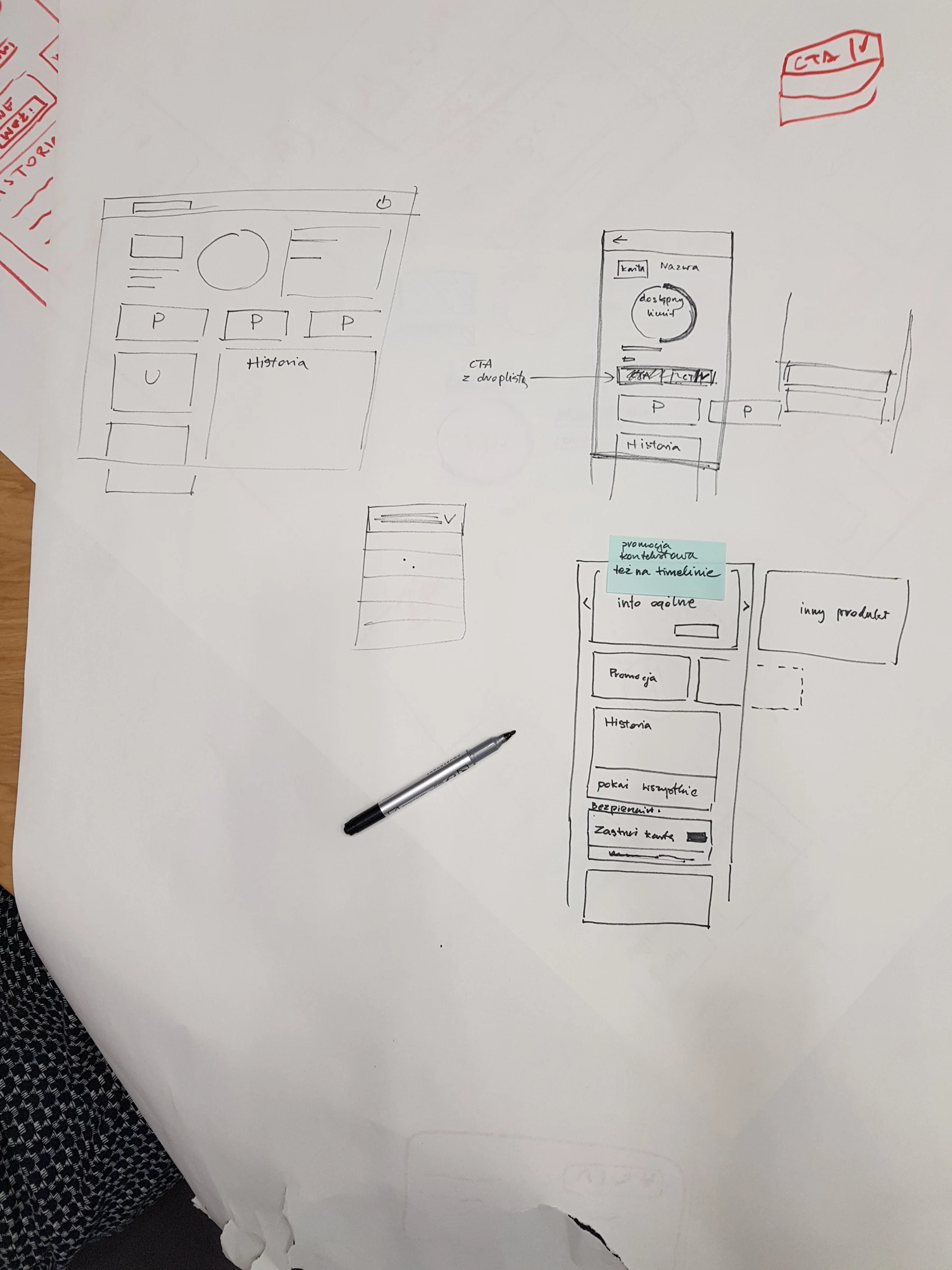
From sketches to interactive prototypes
I ran sketching workshops with stakeholders from across the organization to expose assumptions and gather feedback early.
I prepared around forty iterations of mockups. In Axure, dynamic panels, global variables, and conditional values made the prototypes interactive enough to explore realistic banking tasks.
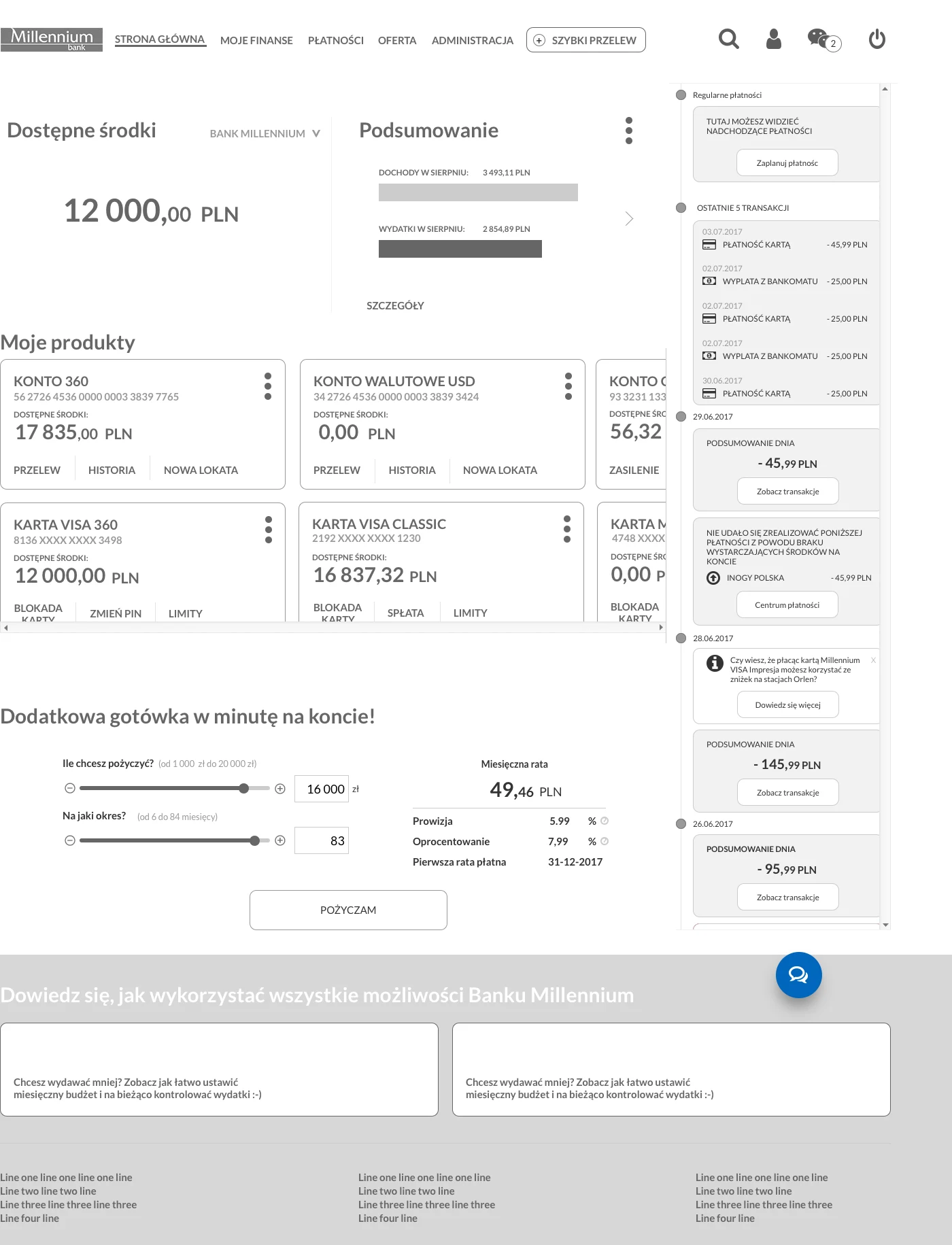
Testing with customers
Working with researchers, I tested prototypes with customers of Millennium and other banks, using desktop and mobile devices as well as Tobii eye tracking.
Sessions combined free exploration with tasks such as blocking a card, making a transfer, and checking an account balance. Findings informed subsequent design iterations.
The solution
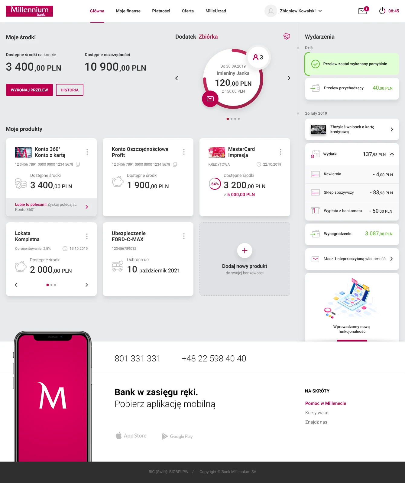
The resulting dashboard organized the experience around four complementary areas:
- Financial overview: balances and access to transfers and transaction history.
- Personalized widgets: useful functions, including quick transfers and upcoming payments, brought directly onto the dashboard.
- Timeline: transactions, security messages, relevant offers, and unfinished applications in a personalized communication area.
- Product tiles: key product information and common actions, with additional options available on the reverse side.
Responsive views
The original portfolio also documents the interface in narrow layouts. These examples show how information and banking actions were arranged for smaller screens.



What this work demonstrates
The project brought together behavioural data, qualitative research, interactive prototypes, and detailed product design at banking scale. My contribution included both design leadership and hands-on work on the solution.